If you’ve used computers for a long time, you’ll have trained yourself subconsciously to use the visual language of using a computer of that time. You may have even been using the language of one dialect of computers for all your life and that is dangerous.
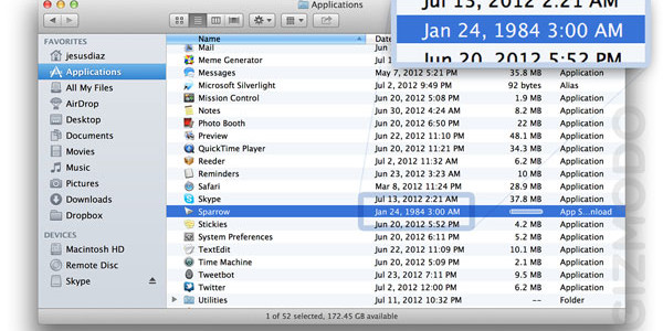
It breeds a certain expectation of how things should work; for instance we might consider the seemingly ubiquitous floppy-disk-as-save shorthand. That save icon has lost the original meaning the skeuomorphism suggested; that button is pretty esoteric to someone who has only used computers in the current environment of always online cloud computing. I however have had the misfortune of learning that the picture of the floppy disk means ‘save’ to the physical floppy disk and therefore people of my generation have kept that in the design language of computer systems. I feel sorry for younger people in school today when they encounter software written by someone my age. It’s the visual equivalent of calling a Toyota Prius a ‘motor car’.
hamburger menu icons
We’re surrounded by really bad iconography and user interface, because what we’re trying to convey is too complicated or taboo to encapsulate in a single little picture. Also, we’re quite adept at learning that a strange little symbol means something – one such example is the hamburger icon, which I personally like, but I have heard so many people complain about it. If you don’t already know it represents a menu, and short of something better coming along conveying visually that a menu will appear when you click it, we’re going to be stuck with it so get used to it.
It’s exactly why I struggled using Microsoft Office’s groundbreaking “ribbon interface”. It just became so confusing that I simply starting using a more familiar alternative that aped a much earlier version.
Jellyfish jumping out of a waterfall
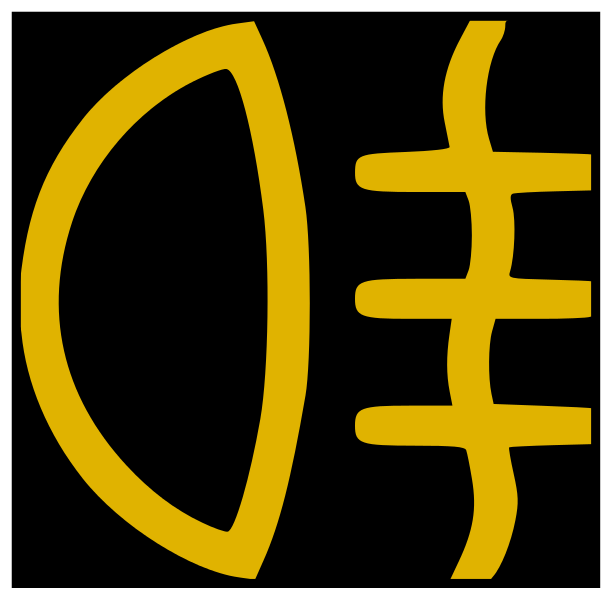
Car designers along with equipment manufacturers also struggle with icons as they face the same issue: a device with hundreds of words representing functions would be very difficult to sell internationally. Thankfully, context sometimes comes to the rescue in most programs and devices and allows the user to have an innate clue as what that button might do by scanning eyes around the device. The rear fog lamp, which is a strangely European requirement on cars, has an icon apparently totally confusing to other nationalities as they don’t have them; so an icon showing an old fashioned headlight isn’t going to immediately be obvious to the first time user.
Snooze
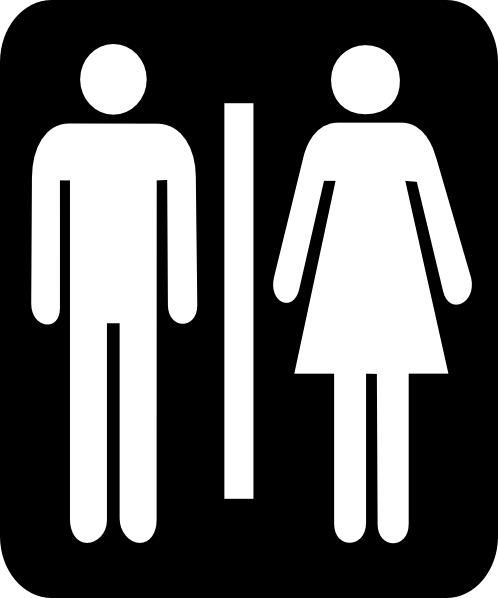
My personal favourite poor iconography is the humble unisex toilet sign: I always assumed as a young child it was a bedroom to take a snooze in. I think it was because at that time most toilets just had the word “GENTLEMEN” on, and unisex toilets were relatively rare except on trains which just read “TOILET”. I guess it was a time when the UK wasn’t accommodating even a little to people who couldn’t speak English. I always felt a picture of an actual toilet would suffice, then I’d not have envisioned a prudish clothed heterosexual couple lying very still on a bed either side of a dividing wall; but then again that might say more about me than it does about the icon.